Email Buttons: The Complete Guide to Email Button Design & Code

A bulletproof email button is one of the most crucial elements of your email design. If your CTAs don’t work, you won’t be able to convert email subscribers. They won’t be able to engage with your content, and all your efforts up until that point have been wasted.
That’s why it’s crucial to make sure that your email CTAs are well done.
In this blog post, we will give you a full and detailed overview of email buttons: why do email buttons break, how to create bulletproof email buttons, and how to design the best CTAs that will guarantee you high conversion rates.
Check out our previous resources if you’re looking for tips on crafting a compelling CTA text.
[optin-monster-shortcode id=”su91iokaqqdf42xj7xnm”]
Tips to keep in mind
To code a bulletproof HTML email, you need to make sure that your buttons are working properly.
Here are a few tips to always keep in mind when coding an HTML email button.
Never use an image as a button
It’s true that you can link your email images. In fact, in some cases, it’s even recommended that you do so. In Gmail for example, download icons are added automatically to images that are not linked.
Not to mention that linked images can help increase your engagement rates.
However, using an image as your email CTA is a worse-case practice. This is because some email clients and email subscribers might turn off images in emails. This means that they won’t be able to view your images anymore. And image email buttons will look like this:
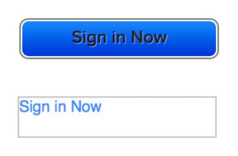
Source. Litmus
The link will still work, but it looks unprofessional and not trustworthy. Some people might even skip it completely, not realizing that it’s a button.
👉The Marketer’s Ultimate Guide to Embedding Images in Email
Don’t insert a raw link in your email
A raw link is a link that shows the URL where subscribers will be redirected. It looks like this: https://chamaileon.io.
Adding a raw link in your emails instead of a bulletproof email button can affect your deliverability and trigger spam filters. Not to mention that it doesn’t enable you to track your clicks, and it looks very unprofessional.
You shouldn’t also add links to full sentences. The only exception is in the case of plain text emails. Other than that, adding a link to a sentence simply looks amateur.

Email buttons should go where they say
The last thing you want is to trick and disappoint your email subscribers. Never lie to your subscribers about the destination of the CTAs. If you are talking about a blog post, your CTA should redirect them to the post. If you are offering a discount on a certain product, your email button should lead to the product page, and so on.
It’s important to double-check all your email buttons before sending, especially if you are using master email modules.
But everyone makes mistakes, and if you happen to send an email with the wrong link, the best thing you can do is send a follow-up apology email with the correct link.
Here’s an example of a correction email from ReallyGoodEmails, after they sent the wrong link in one of their campaigns.
Oops! Speaking of Templates…

The fun and witty subject line, combined with the clever email copy, and the funny email footer makes it impossible not to enjoy this email. RGE knew exactly how to jump right back up and recover from their mishap.
If ever you send a wrong link in your emails, it’s okay! Simply send a second email with the correct link, quickly.
Don’t send emails without any buttons
What’s the point, really? If you send any kind of email, your goal is to engage with your audience. Even if it’s an informational email, like a policy update, or a “letter from our CEO”, your email should always include some kind of call to action.
Here’s an example of a clever email that used a little creativity, and thought outside the box, when it came to their CTAs.

How to code the perfect HTML email button
Do you know if your Email HTML button is bulletproof or not? Follow along with this detailed tutorial to code bulletproof email buttons.
Why do email buttons break?
HTML email buttons can look very different in various email clients. You might have noticed that your email buttons look awesome in Gmail but were blurry and unclickable in Outlook.
Why does this happen? Why do email buttons look different on some email clients?
First of all, it’s important to know that Outlook uses a very different method to display email codes than the rest of the email clients.
Instead of raw HTML, they use their own language format called VML. VML can mess with your simple HTML button easily, so if you haven’t prepared your button for Outlook with VML codes, your buttons will look broken.
What are Outlook-specific VML codes?
Outlook uses its own email rendering scheme that is based on Microsoft Word. If this is new to you, make sure to read our email rendering guide.
We’ve written a lot about the differences between email clients. The email code Chamaileon’s generator provides has the best compatibility with these email clients in the industry (per our users).
Buttons that are not clickable
In most cases, parts of a button aren’t clickable (or touchable) in email. In some cases, the whole button becomes unclickable.
People who fail to click your button wanted to interact with your content and they are unable to do it, which can be frustrating, and lead to lost conversions.
From a technical standpoint, it means that some parts of that button are not considered as a link for the email client.
The parts of email buttons that are not clickable are often:
- Borders
- And in some cases, paddings. Paddings make the button’s “empty” space and that’s where people like to click!
It’s important to make sure that your whole button is clickable, and not only the text parts.
Button Anatomy – HTML Email Button Elements
Email buttons are composed of:
- Text
- Paddings
- Borders

Button text
Buttons should always include a label (text). Some people like to add icons (usually a right arrow). However, this is very rare in email marketing designs.
Button spacing
Paddings make the button a button. Bigger padding means more space for the fingers and cursors to catch.
The bigger the button, the easier it is to click it.
I recommend using slightly bigger top padding than the bottom and using a bit of left and right padding even it’s not needed just to have some “empty” space around your button label.
Button borders
Borders are not clickable in many cases, which is usually okay. However, if you are using a strong button border, you need to make sure it’s clickable.
That’s the reason I recommend using Chamaileon which generates buttons with clickable borders.
Button Background Image
Apart from the obvious elements of a button, there is a tricky one that we didn’t include in this image: the button background image.
Sometimes designers dream of something that is only available in email’s HTML code if we use an image instead of pure CSS. Sometimes we just love to express our imagination and we use a leopard pattern for a button. Why not?
Please be aware that background images in emails are really fragile, especially if we speak about buttons. Outlook email clients make email template developers nightmares if they have to use background images.
If you want to add a background image to your button, you can easily do it in Chamaileon.
How to code the perfect HTML email button
Do you know if your Email HTML button is bulletproof or not? Testing email buttons is a nightmare as we said before. It took days for 7 colleagues to test Chamaileon’s auto-generated email buttons for 16 complex button variations in 113 different email clients. That’s a lot of testing effort!
The best choice to be sure your email buttons are good is to check your button against all the major email clients your audience uses. Check click-through rates very closely and watch feedback from list subscribers – one of them might report an error.
In a nutshell, you can use an email button generator, or an email builder like Chamaileon to create your whole email but if you choose to develop email buttons by yourself, you must follow along with this detailed tutorial to code bulletproof email buttons.
The easiest way to design email buttons
If you are looking for a quick, easy, and bulletproof way to code email buttons, you can use an email builder like Chamaileon. You can design email templates, and choose the style of your email CTAs, and our code generator will automatically provide you with the perfect quality HTML, that you can either:
- Copy and paste into your email service provider
- Sync directly to your ESP through our preset integration.
Here’s how you can use Chamaileon to design an email button, with perfect code quality.
- Drag and drop a button element in your email template

2. Write a compelling email CTA text

3. Add your link.

4. Adjust body text settings: font, color, and size.

5. Adjust your butting margins.

6. Adjust button paddings.

7. Add a border, and change the border color and radius.

8. Change your button background color.

9. You can even add a background image to your button. Simply activate the “Background Image”, choose your image, and click ok!

This is what your email button will look like with a background image:

Best email button designs & inspiration
In this section, we will present a few email templates that feature cool email buttons designs. You can check them out, and get inspired if you want to spice up your designs.
In this email example, the button has only a button border, which gives it a simple yet elegant look, which matches the overall feel of the email.
Subscribers still recognize that it’s a CTA, and they can see clearly where to click.

Nike uses a more rounded CTA, which reflects movement and agility. Their email buttons are big and imposing, which is important to stand out next to the huge email header and the centered product image.

Notice how the email button has wide padding options, which is a good practice in email accessibility.
In this next example, all email button borders have been committed. The email button feels like it’s embedded directly in the product card.

An arrow icon has been added to emphasize even more the fact that’s a button.
Banana Republic’s email showcases a button with a transparent background. It gives the email a very elegant and smooth look. It doesn’t disrupt the design, but by setting very large paddings on the left and right sides, the CTA stands out.

The email buttons in Frank Body’s emails are always big and flashy. It completely matches the brand tone, and always guarantees that no email subscriber misses it.

Social media buttons in emails
You can add social media buttons to emails. Social media icons are usually added to the email footer, as the last engagement element. The goal is to increase your social media followers through email and engage with your audience on multiple channels.
Including social media buttons in your email is one of the simplest and most efficient ways to integrate your email marketing and SM efforts.
Using Chamaileon, you can add connect your social media channels to your email designs, in one swift drag and drop motion.
Simply insert the Social Media element in your email templates, and you’re good to go.
You can change the style, size, and alignment of your social media icons.
👉 Learn more about adding social media buttons to your emails.
Background image in email buttons
You can add an image to your email button. This will make your CTAs pop out even more, and catch the attention of the readers.
You can easily add a background image to your button, in Chamaileon, for free.
Learn how to create button elements in our drag and drop builder!
Email buttons in email header
A lot of e-commerce brands add a menu to their emails. We have talked about this in-depth in our article about email header designs and best practices.

The goal is to guarantee that subscribers will engage with your content, no matter what the email is about. Email menus usually include very standard and general options, like “Shop Men”, “Shop Women”, “Sale”, or “Website”…
Email marketers who use this method want to replicate the website experience through email. And make sure that even if the offer isn’t interesting to some subscribers, they can still interact with the email, and convert to the website.
Wrapping up
Email CTAs are one of the most important components of your email template. Without them, you won’t be able to convert subscribers and reach your email engagement goals.
So make sure your email buttons are bulletproof. It only takes a few clicks in Chamaileon!
[optin-monster-shortcode id=”apk1sdia4l6oxhhgl8u6″]