Dark mode for emails 101 | How to design and test emails for dark mode?
Dark mode for emails has been all the rage lately. In this guide, we’ll break down everything you need to know about this new trend and help you get the essentials to design emails adapted for this setting.
What is Dark Mode?
Dark mode also called black mode or light-on-dark mode is a setting in which text and visuals are presented in a light-colored scheme on a dark (usually black) background.
Some apps allow users to toggle between light mode and dark mode using a quick and simple switch.
Here’s why dark mode has increased in popularity:
It’s easier on the eyes
When dark mode is on, users find it easier to consume information and look at the screen, especially when they first wake up or when using the phone in a dark room.
“Everyone can relate to being in a room where the lights are turned down and you’ve got this white screen blinding you.” Sameer Samat, VP of PM of Android and Play at Google.
With dark mode activated, your eyes will get a rest.
In fact, studies have shown that bright screens cause symptoms of digital eye strain, dry eyes, blurred vision, and headache.
It saves battery
It’s been confirmed that dark mode helps prolong battery life. According to Weekdone, dark moe can help save up to 60% of battery life on Android and 30% on iPhone.
The difference between the percentage comes from the type of screens used in Android and iPhones. On Android, OLED screens turn pixels off when dark mode is activated, which reduces battery life considerably. On iPhone however, LCD screens still require power to display all colors (both light and dark).
It’s important to understand the benefits of dark mode before diving into designing emails adapted for this color scheme.
It looks cool
This might not be enough of a reason for you to convince your team of the importance of considering dark mode for your emails, but your subscribers certainly do. When dark mode is on, plain boring dashboards and apps are suddenly transformed into rich and mysterious gems. Not to mention that light text and visuals n a dark background is easier to read.
Dark Mode for Email
Dark mode for email entails the same thing. It’s when your email design is switched from light mode to dark mode, following the preferred settings of your email subscriber.
How does dark mode for email work?
Before setting out on designing emails for dark mode, it’s important that you understand how it actually works.
Let’s say you design a product launch email. It looks great. Your colors and visuals appear on all email clients and devices just as you’ve intended for them.
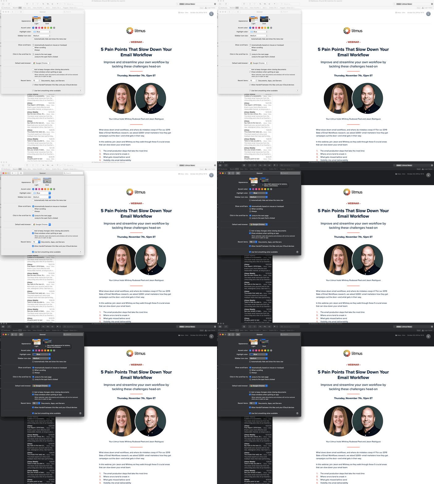
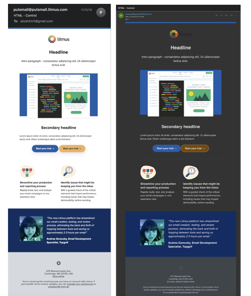
Now, let’s say a user switches on dark mode on their email client. Your email colors will probably change and you don’t recognize your design.
What happens is that dark mode inverts the background and font colors from dark to light and from light to dark. The degree of color inversion depends on the email client.
In your email code, there are CSS properties, such as Background, or color, or background-color, and other HTML attributes that are related to the color scheme of your emails (bgcolor, color).
Dark mode targets those attributes and basically inverts the color codes used. It’s not that simple tough, there are at least 5 different methods to invert the colors, used by the different email clients. Continue reading to know more about each different dark-mode method.
What email clients support dark mode?
More and more email clients are supporting dark mode in emails:
- Desktop email clients
- Apple mail
- Outlook 2019 (Mac OS and Windows)
- Mobile apps
- Gmail (Android, app iOS 13, iOS)
- Outlook (Mac OS, Windows 10, app iOS 13)
- Apple mail (Mac OS, iOS 13)
- Web email clients
- Outlook.com
- Orange webmail
There are also some email clients that have a dark theme without impacting the emails’ color scheme, such as Yahoo mail (app and webmail) and Gmail Webmail.
Check out our complete email rendering guidebook.
How do email clients handle dark mode?
Every email client presents dark mode emails differently. In short, there are three main scenarios that can happen when a user activates dark mode on their email client.
No changes to the email:
Yahoo mail, Gmail webmail (in the browser)
In the case of Yahoo mail or Gmail webmail, emails don’t change at all when dark mode is activated. Instead, it’s the UI of the email client that shifts to dark mode.

Source: Litmus
-
Partial color invert:
In this scenario, the email client detects the light-colored sections (text, boxes, etc) and inverts them into darker colors. (Outlook.com)

Source: Litmus
-
Full-color invert:
Full-on color invert. Light colors become dark and dark colors become light (which is somewhat counterproductive). (Gmail app and iOS 13). This is how Gmail inverted our dark background into a lighter one.

Here’s a quick recap of which email clients support dark mode, and to which extent they change your email colors.
| Email Client | Dark Mode Level |
|---|---|
| iOS Mail | No changes |
| Aplle Mail | No changes |
| Yahoo Mail (app & webmail) |
No changes |
| Gmail webmail | No changes |
| Outlook.com | Partial invert |
| Outlook (iOS, Android) |
Partial invert |
| Gmail app (Android) |
Partial invert |
| Gmail app (iOS 13) |
Full invert |
| Outlook 2019 (Windows) |
Full invert |
How to design emails for dark mode?
Rest assured, you won’t need to design two different versions of your email for dark mode. There are a few simple tips and tricks that you need to keep in mind when adapting your emails for dark mode.
Don’t forget that every email client handles dark mode differently. With that in mind, here’s what you can do to design emails for dark mode.
Optimize your visuals for dark mode
Your text and background colors will be automatically inverted by your email client. However, no changes will occur to your email images, regardless of the email client.
That’s why it’s important to prepare your images for dark mode:
- Make them PNG with transparent backgrounds
- Make your logo transparent
- Don’t forget about social media icon transparency
A nice hack that adds a little something to your emails is to add a white shadow to your logo and other visual elements of your email.
Test your emails
What better way to be sure that your emails look great on both dark and light modes than to actually see for yourself. Using email testing tools like Litmus and Email on Acid, you can generate hundreds of email previews on different email clients, devices, and settings.
If you don’t have the budget to pay for this, you can simply turn on dark mode on your email client and see how your email looks.
Take a look at your email subscriber list and see which email clients they use the most. And make sure to test your email template on those email clients.
[optin-monster slug=”jqsk2ovqpxrre7qu7dhr”]